Thursday, May 20, 2021

Final Project

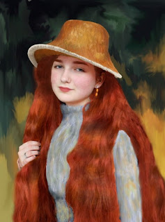
For your final project, you will be creating a collection of photographs with a theme.  The theme can be anything – but all of your photographs must be connected by this theme.You will be compiling a collection of at least 5-10 edited photographs.  

Some ideas of themes:
  • Choose a photography career to explore (wedding/event, or magazine photographer)
  • Choose a subject matter theme (nature, macro shots, portraits, etc.)  
  • If there was a specific editing technique you really enjoyed, have that be your theme (colorized black and white, antiqued image, classic art recreation, photomontage, etc)
I will be grading based on you demonstrating a variety of ideas you learned this semester both regarding composition of the photographs as well as editing - so make sure you challenge yourself by choosing a theme and editing style that is complex enough to show off everything you've learned!


Monday, May 10, 2021

Project 8: Elements of Art and Principles of Design

This is a two part project, it consists of a photoshoot and then you will use the pictures from the photoshoot to create posters for each of the elements and principles.  A majority of your time spent will be putting together the posters.

Part 1:

For this part of the project, you will take one photograph that focuses on each of the 13 elements of art and principles of design listed below

The elements of art are the concrete, basic parts of an image:

1. Texture – Actual or implied surface quality
2. Shape – A flat area bound by line or other elements of art, can either be organic or geometric
3. Form – A shape in three-dimensions, or a shape that gives the illusion of three-dimensions.  Usually has strong highlights and shadows to show the dimensionality of an object
4.  Line – A continuous mark with a greater length than width
5. Space – The distance between or around objects; positive space is your subject(s), while negative space is the background information or the area in between objects
6. Value – The lightness or darkness of a color – think of a monochromatic color scheme
7. Color – Also known as hue, color is created by the light that reflects from an object. When photographing to demonstrate color - think about utilizing the color schemes discussed in the colorized black and white project


The principles of design are an arrangement of the elements of art.  They help you carefully plan and organize your use of elements of art so that your artwork will attract attention and hold interest:

8. Balance – Objects having equal or similar visual weight; arranging elements so that no one part of a work overpowers, or seems heavier than any other part.  Balance can be symmetrical, asymmetrical, or radial.
9. Emphasis – Elements of art creating interest and drawing the eye to a certain area of the composition 
10. Movement - The suggestion or illusion of motion in a design
11. Contrast - Using elements that conflict with one another; for example light and dark values, color opposites (complementary colors), smooth and rough texture, etc.
12. Rhythm – Some elements recurring regularly in a path indicating movement or continuity; it can make the composition appear active.  Similar to unity, but the elements should occur in a regular path or pattern
13. Unity – Elements of art working together to create a cohesive composition, element occurring irregularly throughout a composition.  Similar to rhythm, but the elements are not following a distinct path

Part 2:

You will create 13 posters - one for each of the elements and principles.  Each poster will be 8.5x11 inches (or 11x8.5") and a minimum of 180-300 resolution.  You can use either photoshop/photopea or canva to make your posters.  Your posters will all contain the following:
  • The name of the element/principle
  • The given definition of the element/principle.  You may copy and paste the definitions above (please do not include the writing in italics from the definitions, those are points I put there to help you take effective photos of each concept).
  • 3 photos (at least 1 should be your photo from the photoshoot - the other two can be photos from old assignments, or found images (give the artist credit if you are using someone else's work), or other types of graphics (for example - for color you can use a color wheel, for value, a value scale, etc)
  • A brief description for each of the 3 images on why you used it for that particular element/principle.  Try to avoid the obvious sentence starter of "I chose this picture because...."  As long as you have a good reason why you chose your images for each element/principle, this part should be fairly simple and you should have a good, well thought out description to write.  A poster should have minimal words, so your description should not be long, but should be concise and meaningful.  Your description demonstrates your understanding of the element/prinicple, so this is the main thing I will be looking for when grading your projects.
Examples:


Monday, April 26, 2021

Classic Art Recreation Editing Tips

How can you make your photograph look like a painting???

It all depends on the style of art that you chose, different techniques will be required for different styles/artists.  This project is all about creative problem solving, but here's a list of ideas to get you started:

  • Filters - use artistic, brush stroke, pixelate, sketch and texture filters to stylize the photograph
  • Use the quick select tool to select areas of your photograph - use adjustment layers to adjust hue and saturation, color balance, etc. of certain areas.  You can also do multiple layers and use the eraser tool to expose layers beneath other layers.  We will be doing the "filters project" next week as preparation for the editing for this project.
  • Use the quick select tool to copy and paste parts of photographs into other photographs - be careful to make a good selection and refine the edge well
  • Use the smudge tool - this smudges colors together and can look like brush strokes (nested below the "blur" tool).  
  • Use the paint brush tool - pick a color from the color selection palette or use the eye dropper tool to select a certain color from your photograph.  Use a series of transparent colors to draw on the photograph
  • Clone Stamp tool - this can be used to cover things up or to add colors from one part of photograph to another part
This is just a basic list of ideas - try a variety of tools out and experiment with photoshop for the best results possible.  The editing for this project will be very individualized based on the style of art you choose, and will require you to experiment with photoshop to get the best editing results for your individual project.


Project 7: Classic Art Recreation

Classic Art Recreation with Photography

For this project, you will be recreating famous classic pieces of art through photography.  Obviously, it will not be an exact replica of the paintings, but try your best to pose your model, arrange a still life, and/or recreate as many elements from the painting as possible.  You will then edit the photograph in Photoshop (by using adjustment layers, filters, and more) to make it look as similar to the original as possible.  

Pick one artist or art movement, and recreate a minimum of three of their paintings utilizing photographs and Photoshop

Here are some art movements to begin your search:
  • Expressionism
  • Impressionism
  • Post-Impressionism
  • Cubism (you could do a cubist photomontage to recreate the paintings)
  • Pointalism
  • Surrealism
  • Art Nouveau
  • Roccoco
  • Baroque

You can also search by artist, here’s a list of a few artists:
  • Van Gogh
  • Monet
  • Manet
  • Renoir
  • Degas
  • Picasso
  • Dali
  • Rubens
  • Seraut
  • Boucher
  • Vermeer
  • DaVinci

Of course, these are very small lists, feel free to search for “art movements,” “styles of art,” “painters” or “artists” to find more ideas.

Be creative and have fun with this project!  It is a challenging project that requires lots of trial and error with editing.  

This project is due: Wednesday, 5/1

Examples:


Photograph:


Painting:


Photograph: 

Painting:


Photograph:

Painting:


Photograph:

Painting:


Photograph:


Painting:


Photograph:


Painting:


Thursday, April 15, 2021

Project 6: Cubist Photomontage

Your assignment is to create a series of three photomontages that have a common theme.  The photographs must be edited to create a cubist style photomontage.

A photomontage is like a collage that involves joining two or more photographs to create a composite image. 

Cubism is an art movement that was lead by Picasso. In this style of art, objects are analyzed, broken up and reassembled in a way that shows multiple viewpoints of the same object. 

You will need at least 3 angles of each of your subjects to create the 3 photomontages.

 You will deconstruct and put your image back together using the rectangular marquee tool on Photoshop/Photopea. 

Theme Ideas (These are just ideas - you can definitely pick something not on this list too):

- Flowers
- Architecture
- Portraits
- Nature
- Beach
- Macro


Friday, March 19, 2021

Color Coded Example Gallery

 Red - Danger


 Orange - Warmth/Adventure


 Yellow - Happiness/Joy


Green - Natural 


Blue - Tranquility/Coldness 


Purple - Royalty/Harmony


Gray - Loneliness


White - Purity 


Black - Power/Elegance


Brown - Earthiness

Project 4: Color Coded

For this creative challenge, you will be creating a series of at least 10 images.

You will take 10 or more photographs, each focusing on each of the a different hues (colors) listed below.  The challenge is this: take a photograph that not only emphasizes each of the colors, but use the colors to create a certain mood or feeling in your photographs.  

Don't only use objects in the photographs as the only means to give the photos a certain color feeling; think about utilizing light to give photographs a common hue. You can also use adjustment layers to emphasize hue/saturation in the photograph, but the color scheme should look realistic

Listed below are some colors you can use to create different feelings. Think about color psychology and symbolism as you’re taking the pictures as well; all colors give a different feel to your work, try to portray at least one of the associated feelings to the photographs through the use of color.
The following are some of the common associations of colors:

Red – Passion, blood, danger, urgency; red is a very dominant color so even a small amount can be powerful, and it is used to warn us, pictures containing a lot of red creates tension.
Orange – Warmth, optimism, adventure; orange is a very inviting color and it is mentally stimulating. 
Yellow – Happiness, joy, richness; yellow is also a dominant color, it causes a subject to really stand out; sunsets or sunrises produce a very golden hue to the surrounding subjects, but think about using subjects other than light that have a yellow hue as well.
Green – Life, health, nature, purity; green can be a very fresh color when used to capture landscapes and other nature pictures, but be careful, when using filters/hue adjustments, green can make subjects look sickly
Blue – Tranquility, hope, freshness, cold, sadness; blue can often be a reassuring, fresh color, but can also give a photograph a chilly, or even lonely effect.
Violet (Purple) – Royalty, imagination, spirituality; purple is a very introspective color, it is very harmonious, while also promoting a sense of wealth and extravagance.
Black - Associated with power, elegance, formality, death, evil, and mystery. Black is the symbol of grief.
White - Associated with light, goodness, innocence, purity, signifies safety, purity, and cleanliness.  White usually has a positive connotation.
Brown - Earthiness, strength and dependability.  Brown is also often associated with security, safety, and stability, like the earth.
Gray - Sadness, neutrality, lonliness.  A gray hue in photograph can have an overall depressing, or neutral feeling, depending on how it is used

For more in depth info on color psychology, take a look at this website


You will be graded on the following:

  • The overall use of color
    •  For this project, your focal point is the color of each photograph.  Remember different ways you can "define your focal point".  Here's some ways to emphasize the color/focal point of your photo: 
      • Use the rule of thirds
      • Use Depth of Field
      • Use Color/Value - do a colorized black and white
      • Utilize Hue/Saturation or Selective color adjustment layers to brighten/intensify colors
      • Use your imagination - the possibilities are endless in ways that you can emphasize colors in your photographs
  • Composition - pay attention to the compositional tips we have learned in this class - think about how you can use tips such as "move in close," "define your focal point," or "rule of thirds" to make the colors the focal point of the photographs
  • Creativity in subject matter - did you challenge yourself to seek out the most interesting, creative subjects possible?
  • Ability to portray the color associations in your photographs
  • Editing - did you edit your photographs in such a way that it enhanced the overall photograph, the colors, and the color association?
  • Posting - Everything should be organized and labeled with the color as well as the color association/feeling you were trying to create in your photograph